
Reimagining the Local News Reader Experience
Reader Experience Redesign
Redesigning the reader experience for a national local-news publisher, focused on access, subscriptions and the habits that bring readers back.

From a Publishing Platform to a Reader Relationship System
The client publishes local news across a large network of markets, and its subscriber base had been shrinking for years. I joined a five-person design team at the end of discovery to redesign the reader experience end to end. My work centred on the moments where readers either find their way in or give up: signing in, subscribing, gifting and coming back. The goal was to help readers feel value before being asked to commit.
Local News, Digital Publishing and Subscriptions
Senior UX Designer
UI/UX Design
UX Research
UX Strategy
Wireframing
Interaction Design
Information Architecture
Design Systems
Local news readers, subscribers and former subscribers across many local markets
Sign-in and sign-up, gift subscriptions, compare plans, dashboard, newsletters, design system contributions

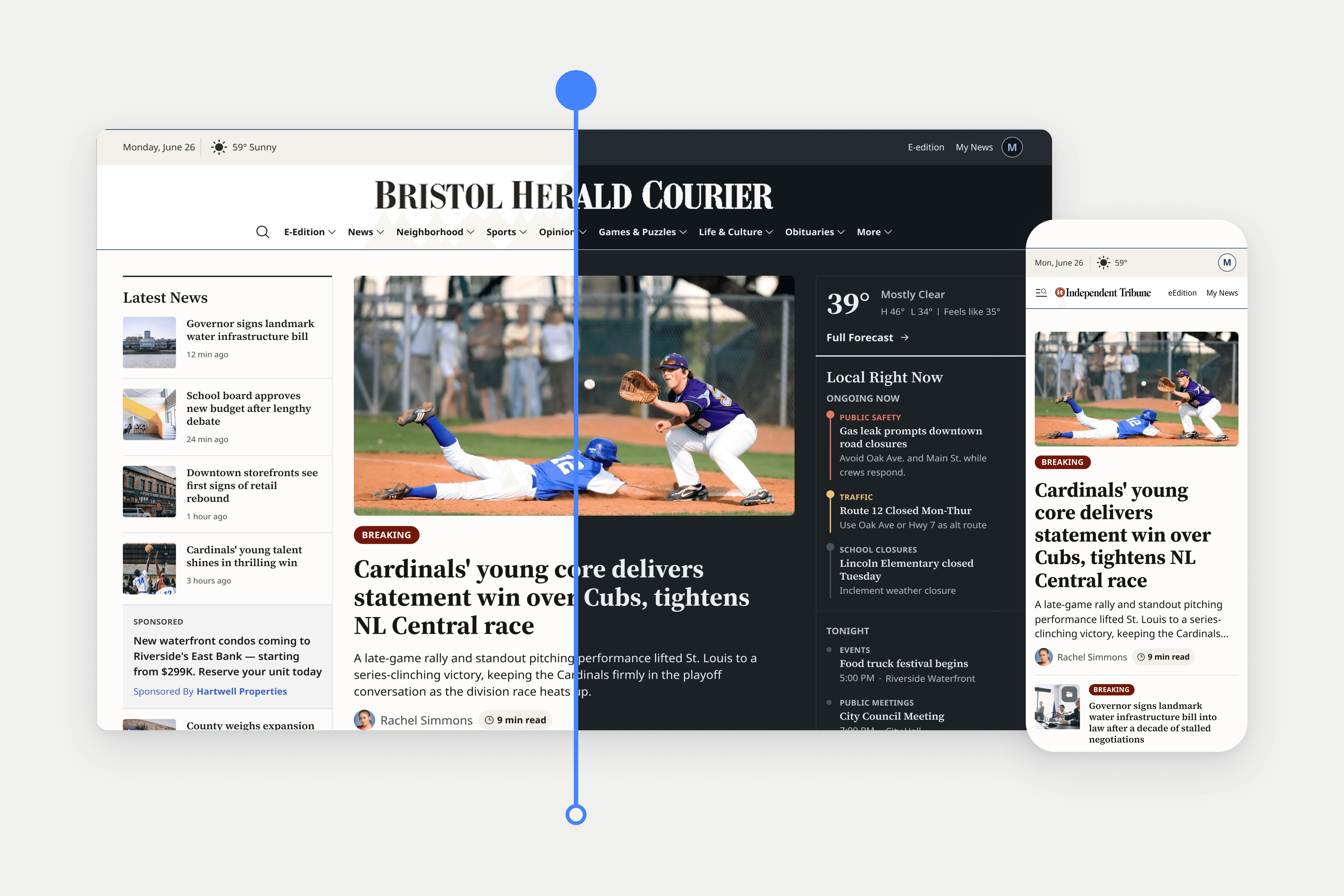
An Aging Platform, Frustrating Access and Slipping Subscribers Set the Stakes
Declining Subscribers
Sign-in and sign-up, gift subscriptions, compare plans, dashboard, newsletters, design system contributions
Access Friction
Login was the top support complaint, including for subscribers who hit a paywall.
Overwhelming Discovery
Readers needed an easier way to find relevant stories without feeling overwhelmed.
Aging Experience
The site was many years past its last redesign, with personalization still to be built.
Local Identity
One shared experience had to serve many publications without losing local trust and familiarity.
These issues made it harder for readers to find, trust and return to local news, limiting the publisher's ability to retain subscribers.

Modernize the Experience, Remove the Friction, Keep Readers Coming Back
Reduce Access Friction
Remove the barriers that push readers and subscribers away.
Value Before Commitment
Show readers what a subscription supports before asking them to pay.
Personalization Foundation
Make personalization a subscriber benefit that grows from simple preferences to behavior-driven.
Scale Across Publications
Create a shared design system that serves many markets while each keeps its identity.
Build a Return Habit
Give readers reasons to come back, from high-impact pages to newsletters.
Together, these goals aimed to turn a publishing platform into a place readers trust, return to and want to stay with.

Designing Access, Value and Habit for Local News Readers
Sign-In and Sign-Up: Make Getting In Effortless and Worth It
Login was the top support complaint, and the old experience stacked a sign-in form above a long create-account form. I redesigned sign-in and sign-up as one modal with email-first entry. The brief called for passwordless-first, so I explored it fully, then designed a hybrid set of options that can grow into passwordless once the client chose password as the launch default. Entering an email checks for an existing account and routes the reader to sign-in, preventing the duplicate accounts legacy offers had created, while a value panel turns a high-intent moment into a reason to stay.

Gift Subscriptions: From a Third-Party Form to a Guided Checkout
Gifting lived on a third-party page as one long form. I moved it onto the platform as a guided checkout, and because every field had to stay, I used sequencing to reduce the effort. The flow opens one step at a time, with upcoming steps visible but faded, so readers know what to expect while staying focused on the task in front of them. Step one recognizes whether the buyer is registered, new or already a subscriber, so no one re-enters details or creates a duplicate account. The pattern is familiar from ecommerce and from competitors, and payment and consent match the standard purchase flow, so checkout feels like one system.
Compare Plans: Earn the Subscription Before Asking for It
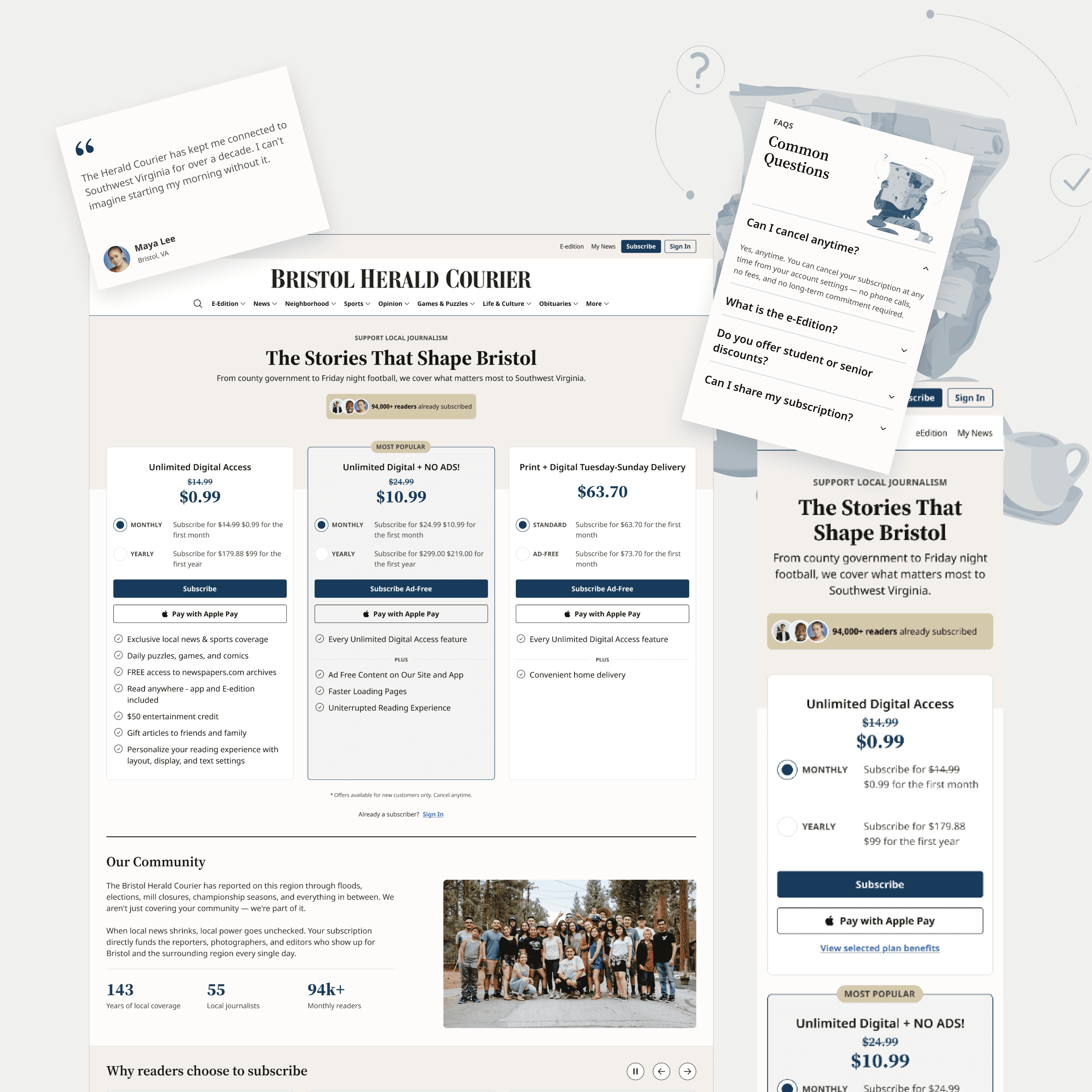
Our team set a principle early: ask for value before commitment. For readers arriving cold from ads, email or social, I sequenced the page to answer what they are buying and why it is worth it, then show plans side by side, then build trust with local photography, a market-specific story and testimonials. I added an FAQ to answer the cancellation, e-edition and sharing questions that cause last-minute hesitation, and plans stack on mobile so readers face one decision at a time.
Games & Puzzles Newsletter: Go Beyond the Brief to Bring Readers Back
The existing newsletter treated games and promotions as separate blocks, linking out to play but giving readers little help choosing what to play next or coming back. I redesigned it to put Daily Puzzles and Daily Comics first, so readers get straight to what they came for, with Most Played Picks to help them find something new. Beyond the redesign, I took on a future-state exploration myself, treating each module as having a distinct job. A Featured Challenge with a local editor’s touch gives readers something to look forward to, and Find Your Next Favorite offers three surprise recommendations by mood and time. For non-subscribers, a free strategy tip from a local journalist adds value up front, while a Subscriber Only card shows what unlimited access adds.

A Redesigned Experience, Built to Scale
Delivered complete, state-by-state designs across sign-in, gifting, compare plans, the dashboard and newsletters, approved over three rounds of revisions.
Contributed to the shared design system, publishing component batches and migrating the library to prepare first-phase developer handoff.
Received written client feedback calling the sign-in design a fan favorite.
Games & Puzzles newsletter approved, with the client asking to keep my future-state concepts for reference.
Requested by the client for a proposed personalization phase, citing a strong impression of my work.
The work is in development and has not launched. These results reflect delivery and client response, not post-launch performance, and the designs were validated through client and internal review rather than user testing.
What This Project Taught Me
Across sign-in, gifting and compare plans, I kept returning to one question: what does a reader need to understand before they are ready to commit? It shaped a value panel on the login screen, a guided gift checkout, and a plans page that makes the case before asking for the subscription. It taught me that access is a retention problem as much as a usability one. Next time I would request more room for wireframing and settle approvals earlier, so the strongest ideas get tested before they are polished.


